
Every software developer worth their salt knows how important it is to focus on the user and their experience of your product. But it’s far easier said than done.
What does it mean to focus on the user? What should developers avoid?
We were not new to web or software development when we launched Trafft. We created and continue to maintain the Amelia WordPress Booking plugin, the product’s predecessor.
With the input of more than 30,000 of Amelia’s users we felt we knew the needs, goals, and preferences of our customer base.
Our goal in developing Trafft was to address the weaknesses of the previous product and to improve the user experience while offering the advanced features that businesses need.
But sometimes developers take software in the wrong direction without realizing it. Here are five of the learnings we took away from our experience of developing Trafft.
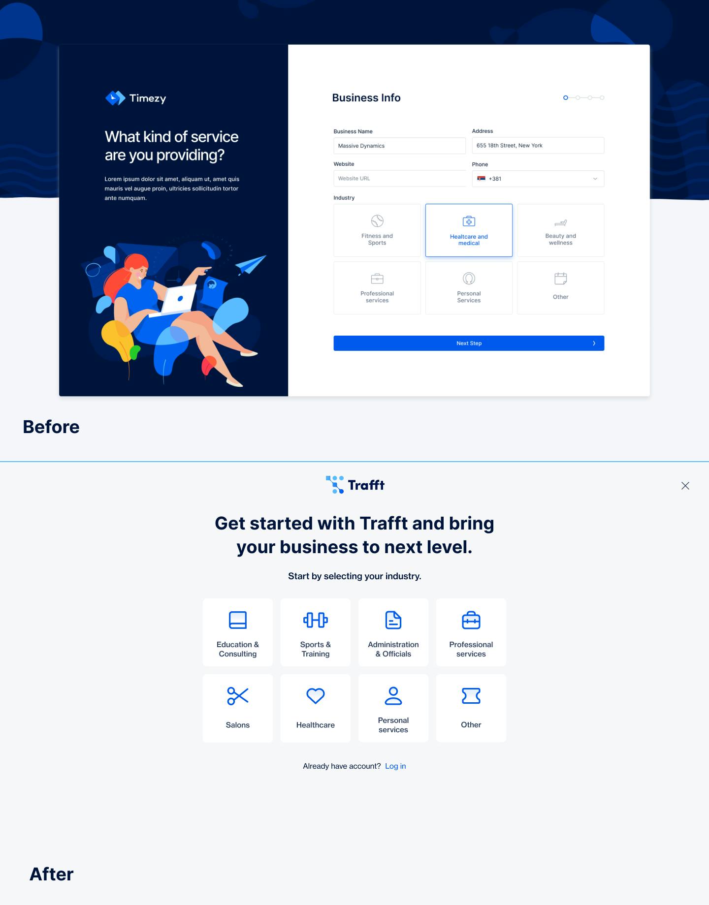
1. The onboarding experience
Developer observations:
To make it easier for customers to start using the app, the team made an onboarding wizard. This allowed customers to configure their business account during the initial sign-up process.
Customers could then add company information, employees, locations, and services. This gave users a head start in setting up the app and meant they could start using it instantly
What we soon realized was that most people just wanted to take a look around. They were curious about the app and wanted to see how it worked. Some were comparing it to other apps and did not have an immediate need for the product. Others wanted to discover more about its features.
As a result, most people skipped the signing-up process or entered dummy data just to get access to the app.
Unfortunately, rushing through the set-up process ruined their user experience as well as the look of the account.
Adjustments made:
We realized something important: The sign-up process should contain only the most basic and necessary steps.
People want to test out the software before committing to it. But they are only willing to test it out for a few minutes. If they are not impressed, they leave. So, developers need to use those few minutes wisely.
They need to showcase the best version of the product, not collect information.
During the trial, users would click around at random. They were looking for something interesting or useful to them. If something triggered their interest, they would pay more attention to it. If nothing interested them, they would leave.
We made four changes in response to these findings:
- We created several demos that allow visitors to see how the software works without going through the onboarding process.
- We removed several onboarding forms. The remaining forms ask for the most basic information to open an account.
- We made the signing-in process as easy as possible. For instance, we included options like “sign in with Google”. This means that users don’t have to manually enter the information.
- To address the number of people leaving before signing up, we are adding testimonials and other marketing tactics to the signup flow.
Overall takeaway:
Look at the conversion process in smaller steps. First, try to engage the user. Then, slowly gather information while introducing new and interesting features of the software. In doing so, the user focuses on the product instead of getting bored by configuration forms.
2. The welcome guide
Developer observations:
We created a welcome wizard that explains the organization of the app and how to use it. The wizard also included videos and how-to screens.
On review, we discovered that most people skipped the launch wizard, opting to explore the app on their own.
They would click on random buttons, go to random screens, and, in the end, lose interest. Their confusion caused them to leave and not return.
Modern users do not enjoy pop-ups and long tutorials. They press the skip button almost instinctively.
But they still need instruction on how to use the app so they understand how to get value from it and don’t leave in confusion
There needs to be a good balance between providing instructions but not boring the user. Guides should be intriguing and brief.
Adjustments made:
The best way to onboard users is to design intuitive and self-explanatory software. So, we tried to simplify the app as much as possible. Unfortunately, this is difficult to implement especially when dealing with complex configurations.
Another method we found useful was to introduce gamification and rewards to engage users.
The aim was to make interaction entertaining. For example, in the first few onboarding steps, we paired choices with illustrations.
After experimenting, the conclusion was clear: It is only possible to force users to engage with two welcome screens. After that, users opt for the skip button. We are still A/B testing what content is best to use in those 10 seconds.
Overall takeaway:
Users who invest time upfront in learning how to use a product are more likely to adopt it and use it in the future. Your product’s interface needs to be intuitive and basic to engage the user.
This isn’t always possible if you provide advanced features. In that case, use simple labels, simple actions, and pre-populate if possible. Introduce gamification and reward methods to offer needed guidance but prevent boredom.
3. Offering advanced features
Developer observations:
Using our experience and the reviews of the Amelia plugin, we created what we thought was a perfect booking tool when building Trafft.
We worked to present the optimal number of features and settings. We reworked many screens to polish, improve, and beautify these features.
After launching, it was clear that the needs of these users were different from those of the Amelia users. There was also a difference between users already using a booking app and those trying one for the first time. Most people did not understand the labels and the inputs. The amount and placement of labels confused many new users.
Several people would enter data at random.
As a result, the app could not work as it should. Then, assuming that the app was unusable or buggy, people left.
Adjustments made:
We needed to strike a balance somewhere between appearing too basic in functionality and overwhelming people with complicated features. We started to hide the advanced features in collapsible menus. This prevents advanced inputs from confusing new or casual users, but the features are still accessible to those who need them.
Overall takeaway:
People get confused when there are a lot of terms, inputs, and screens. They won’t know where to start, especially when they ignore your guides.
A simple “start here” is more helpful to the majority of users. Also, prefilling the configuration settings is helpful for users who just want to test it out.
4. Appealing to non-tech savvy users
Developer observations:
Because we have been creating booking software for several years, the terms and components seem obvious to us. Fields for buffer times, special days, and extras are common booking components. We are also experienced at using different mobile apps and SaaS solutions.
With the Amelia plugin, users did not struggle with booking terms and components. So it was a surprise when users of the new software were confused about the forms, the terms, and how to interact with apps.
We saw that many of Trafft’s users were new to working with booking software and needed help to navigate it.
Adjustments made:
We continue to work on making labels as educational as possible and wherever possible we illustrate the configuration to make it as clear as possible to users. We also present the most common choice as suggestions to users.
Overall takeaway:
If a product is for a broad audience, design it in a way that appeals to both tech-savvy and non-tech-savvy users. It should be self-explanatory so that even a grandparent can use it.
Also, do not base user personas on assumptions or even past experience because these could well be wrong.
5. Making it about the user
Developer observations:
Trafft is suitable for multiple industries, so we used abstract terms to create a general-purpose feel. But this made it less appealing for users with a specific industry need.
Adjustments made:
We have built industry-related variants of the app. We adjusted templates, labels, and combinations to appeal to specific industries.
We also try to leverage LinkedIn sign-up and other tools to pull basic data like name and logo. This makes users feel more at home during the onboarding process.
Overall takeaway:
As much as possible, make the product and onboarding experience about the customer.
Users will enjoy the product more if it speaks the language of their industry and adjusts to their specific needs. It will help them see themselves using the product and will appeal to them.
How to really focus on the customer
The most important tip for focusing on customers is to assume nothing . Do not assume to know and understand the target audience. Do not use generic research and studies to get to know them better.
Surveys and observations are useful for some things. But they do not give a real feeling of what users like or need.
The best way to focus on the customer is to talk to them. Be proactive and speak to people as much as possible.
Do not ignore the information you receive.
When possible, talk to people in person. Spend as much time around potential customers as possible. Watch them interact with the app. See whether it offers value to them. Make note of what they like and what they dislike. Determine whether they are willing to invest in it or not.
Recognize that the customer base will change. So, it is necessary to adapt to their changing needs and circumstances. This is not a one-and-done activity. Make sure to receive feedback on a regular basis.
Conclusion
Every developer has their own experience. Developing different types of software means appealing to different users and needs.
We worked hard to polish the features of Trafft. Yet later it became clear that the needs of the users were different than we previously thought.
The main conclusion is to not delay the release of a product while trying to perfect it. Release the product and observe the first users’ experiences. Collect feedback .
Then, armed with the feedback of real users, polish the software to appeal to the client base. This ensures that a company takes the development of a product in the right direction.