Paddle Billing
 ProfitWell Metrics
Join our newsletter for the latest in SaaS
Paddle's design guru Jon Mayes shares the journey behind art directing Paddle's new look and feel.
Back in 2019, Paddle’s adoption of a pink cat as a brand mascot was relatively unheard of in the B2B space. It stood out in a good way. The trend of the consumerization of SaaS was snowballing. Around Paddle, Dropbox and Typeform were refreshing themselves and borrowing heavily from the design patterns and trends on the consumer side with bright, bold colors and brutalist text. B2B SaaS was beginning to break out of its consumerization shackles, and three years later, the new Paddle brand is another exciting reflection of this progression. We knew we had to retain that quality, not conform, but disrupt and stand out, to go where no man has gone before (you can see where this is going). Space, adventure, 80s 3D Sci-Fi and north stars are what followed. Goodbye Captain Kino, hello Captain Kirk.
1. Illustration - research
After a lot of research, we found that some of the main issues with the old brand were that, while it was pushing boundaries with its accessible consumer approachability, it lacked a sense of premium quality. The aesthetic was too ‘whimsical’ and ultimately immature for the newly evolved product. There was no transparency on UI, the copy was way too convoluted, and we also now served software and SaaS businesses all over the world, so it needed to have more of a global feel. Paddle needed to retain a trendy consumer approach but much more maturely. A few key concepts kept circling in the initial stages of the project: ‘global,’ ‘premium,’ and ‘human-centric.’ These three became very much the bedrock of the exploration that followed.
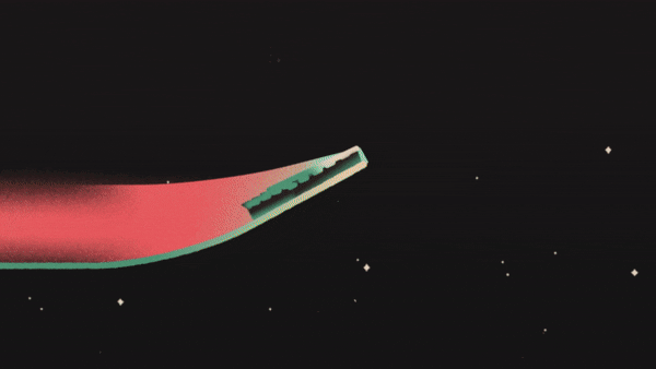
A huge influence on the brand’s style came from discovering all this amazing artwork done by airbrush artists in the 80s. There was no photoshop or drawing tablets back then, and everything was rendered using traditional media. That might bring you to expect acrylic, oil, screen-print, and lino, but a highly underrated art technique that swept the world in the 80s was airbrush art. This style allowed artists to create incredibly meticulous, photo-realistic artwork that felt super stylized, while still clearly being painted by a human hand. The high-quality render with a human-centric touch really attracted me to this style, and it aligned with our key concepts and what we wanted out of this new look and feel. 3D design is also trending in 2022, so it was a relevant and future-proof design direction for the market.
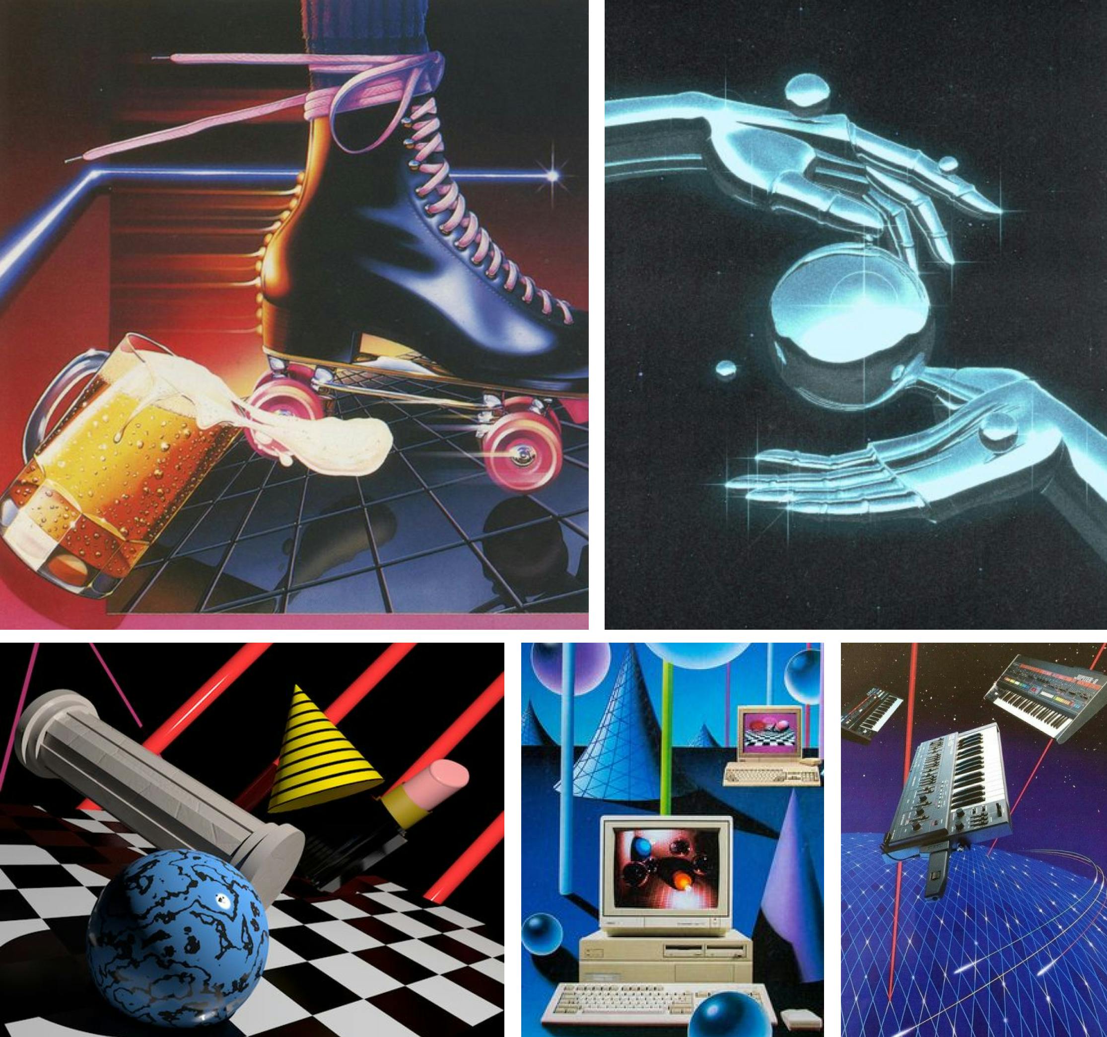
Sci-fi also very much captured the zeitgeist of the time, with the likes of Blade Runner, Star Wars, and Tron sweeping through Hollywood- permeating into all walks of life including art and design. This gave the airbrush, 3D photo-realistic style very futuristic motifs, from shiny chrome materials to robot hands, to heavy use of perspective Tron-like grids, creating boundless landscapes that felt perpetual and grandiose.
The work throughout this period is very sleek- I compiled a mood board on Pinterest at the time, if anyone wants some more 80s retro goodness, have a look here.
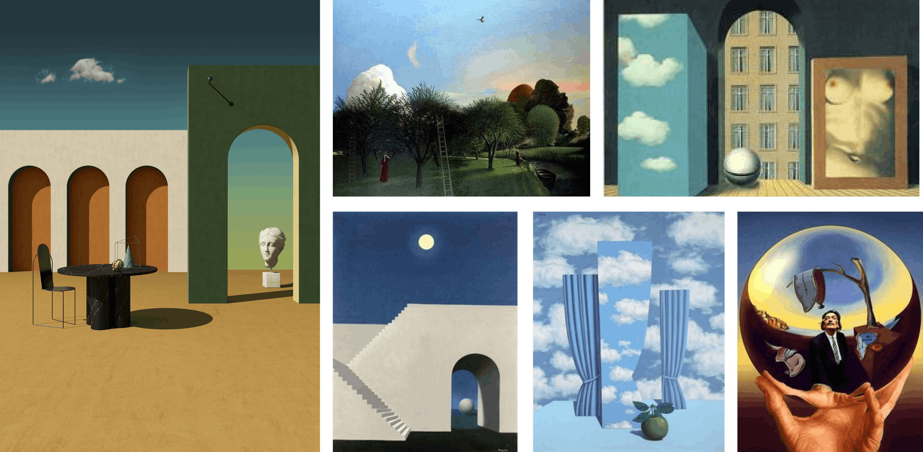
I was also heavily inspired by alot of artists of the Surrealist movement in the early 19th century including Rene Magritte, Giorgio De Chirico, Salvador Dali and David Inshaw. Alot of these works exist on these 3D planes giving that feeling of perpetuity we were looking for, as well having dramatic, emotional lighting spilling across the respective compositions adding drama and interest. Magrittes convention bending is inherently intriguing to the human eye, whilst David Inshaw works contains elements of whats called 'magic realism', fantasy worlds that are grounded in realism enough to really allow you to empathise and get lost in this impressionist reverie, also aligning itself well with the other-worldly sci-fi aesthetic in the research before. These elements played in very nicely to the idea of creating worlds where are sellers are yet to venture into and instilling a feeling of inspiration and excitement.
1. Illustration - execute
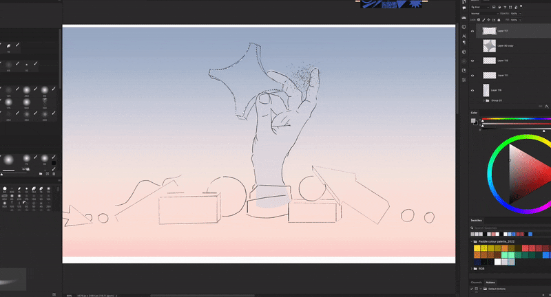
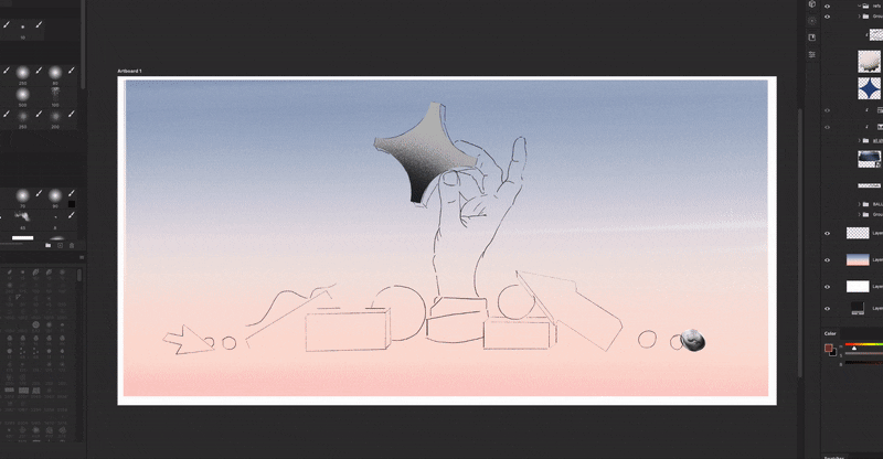
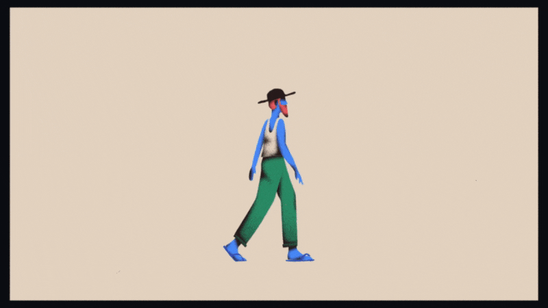
Following the research I began painting the illustrations in Photoshop, utilising various bristle and texture brushes to give the work a hand-painted and therefore human-centric feel.
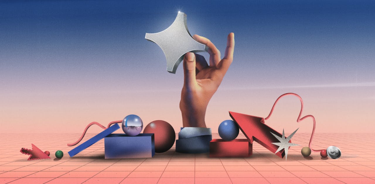
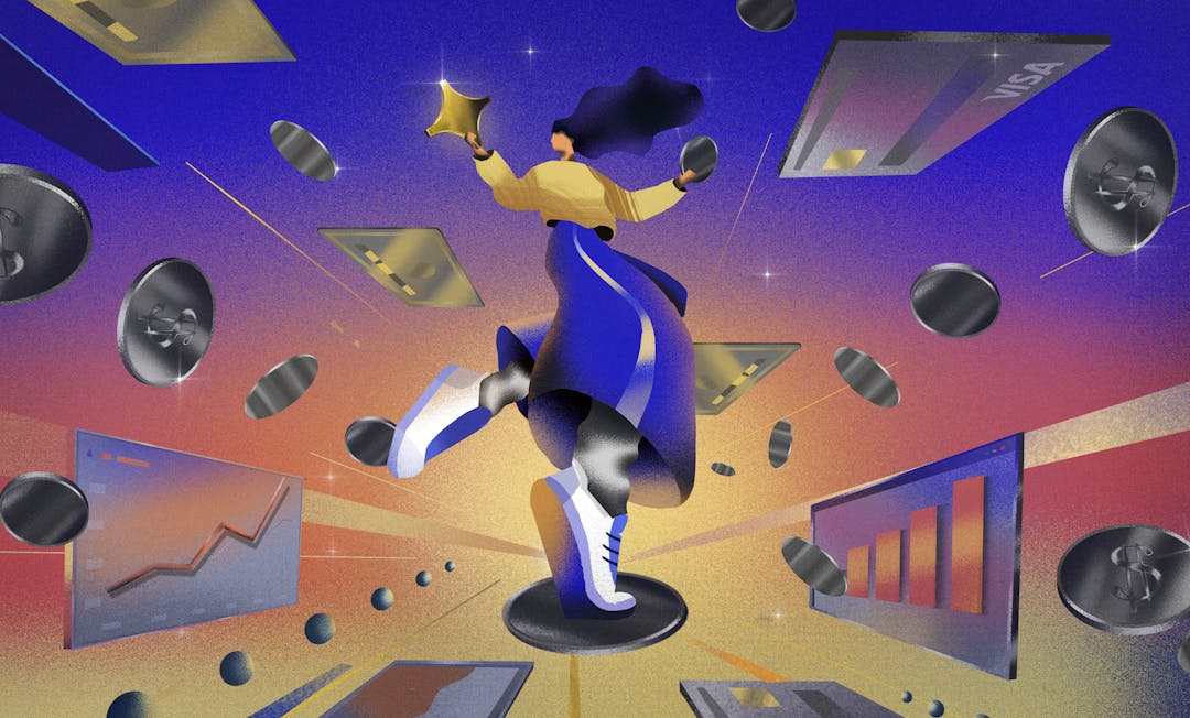
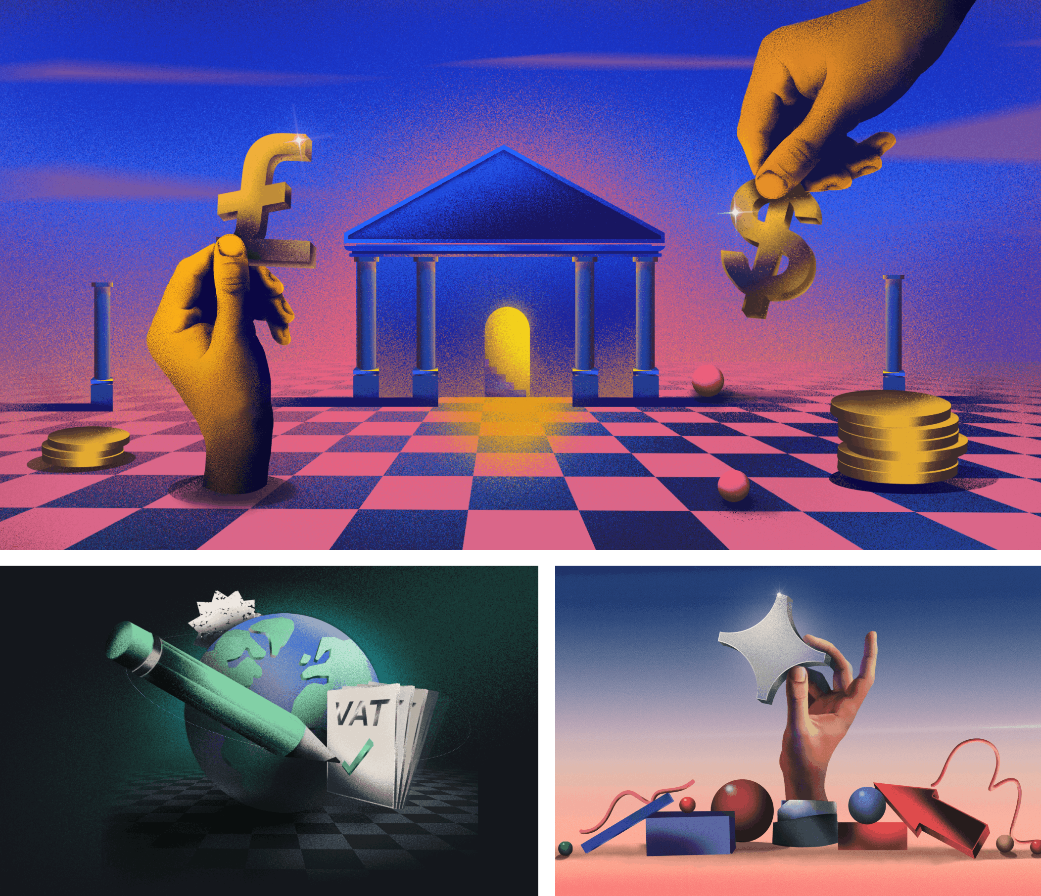
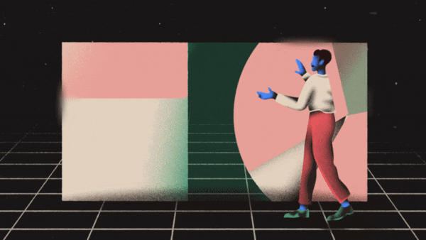
We decided to focus on two types of illustration approach; a more tangible, purpose driven style that represented the features, and then a more grandiose, abstract design to represent the awe-inspiring emotional core of scaling your business to unchartered territories, all whilst having the Paddle 'North Star' as the main brand motif to lead the way of SaaS success . The first designs took inspiration from the research of 80s perspective grids, combined with elements of early 19th century surrealism such as Dali and Bosch. Throughout the style I applied a chrome, metallic treatment on elements in the compositions to give a shiny, premium quality effect, as well as allowing us to utilise lighting on the 3D plane to highlight certain elements.
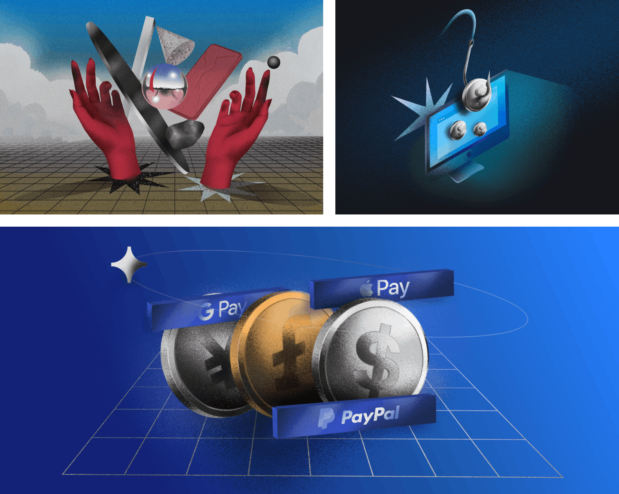
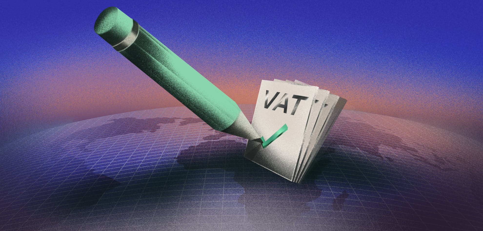
In the end we think the style meets the goals of being global and grand in aesthetic. It’s futuristic, whilst being carefully curated with a traditional painterly application making it human centric. The vibrant colour palette throughout manages to balance well against the dark theme background of the website- bringing a bright and accessible pop-art, trendy feel to the illustration scapes. Together we felt all of these elements were perfect attributes for our new brand approach which positions Paddle as a ‘North Star’ to guide you throughout your journey of growth.
You can see how elements of the above came into some of the final illustrations above and below.
2. UI design
The next job was to solve the problem of a lack of UI across the brand (and by lack of I mean nada). Previously there had been a lot of hesitation about using visuals of the Paddle interface due to the product’s limited interface at the time. Unsurprisingly (in hindsight), it transpired that sellers just became more confused about what Paddle actually does
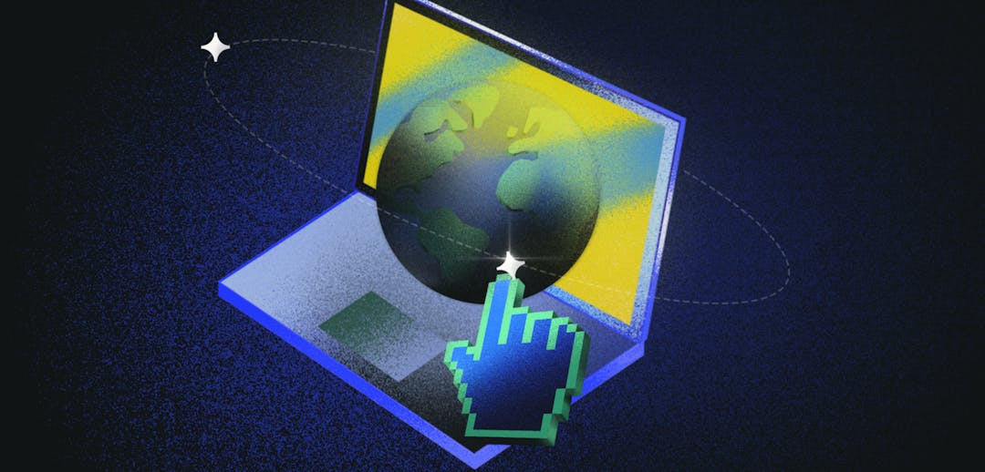
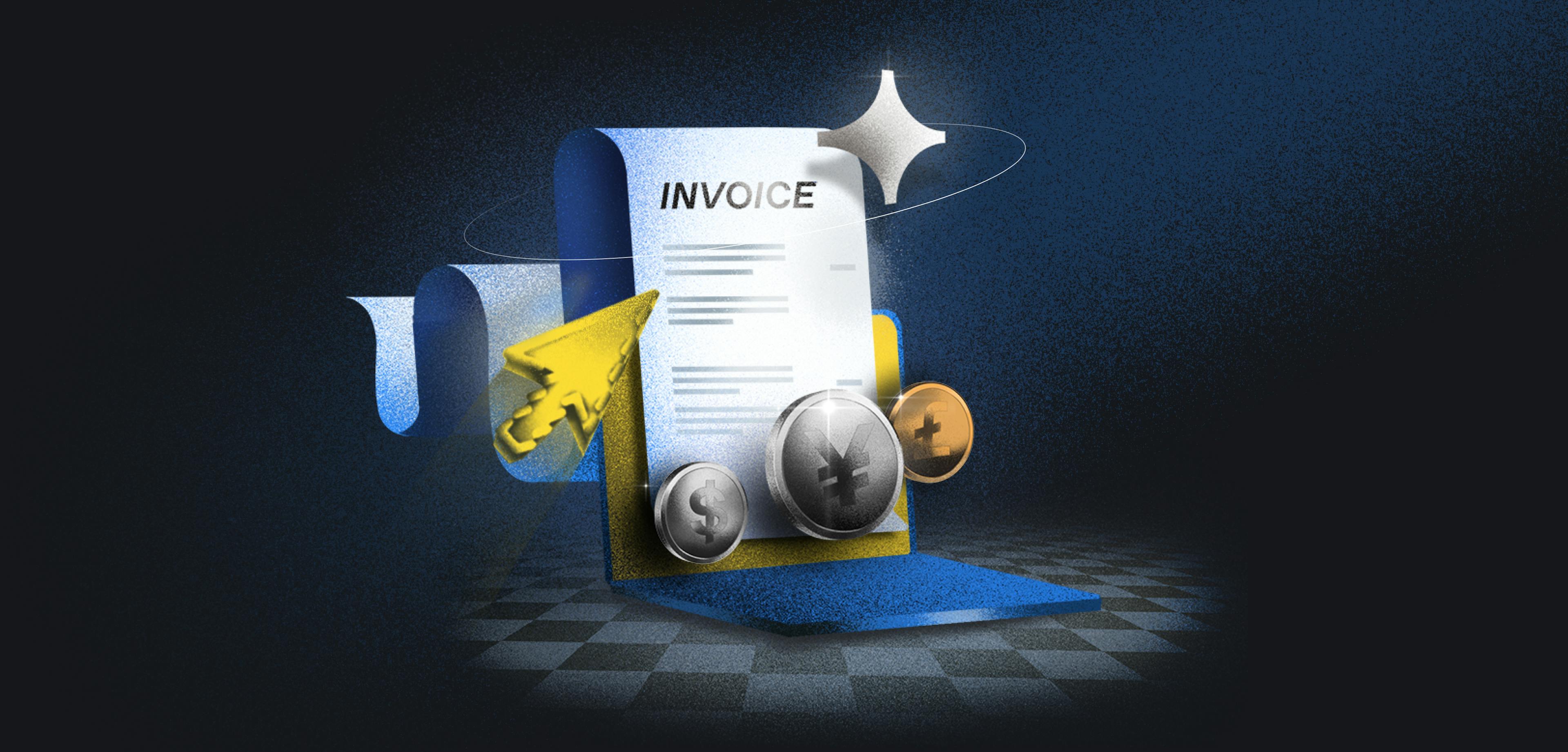
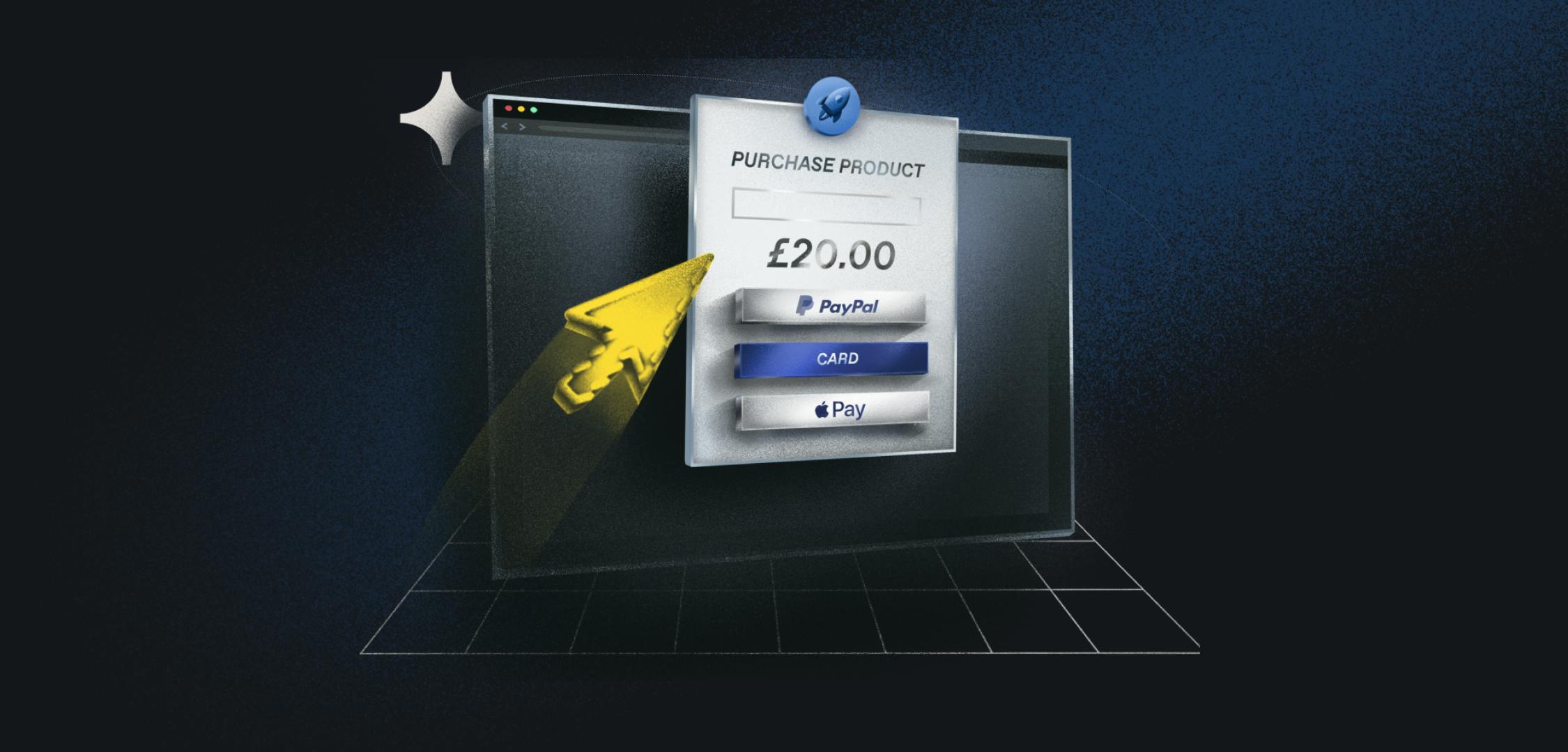
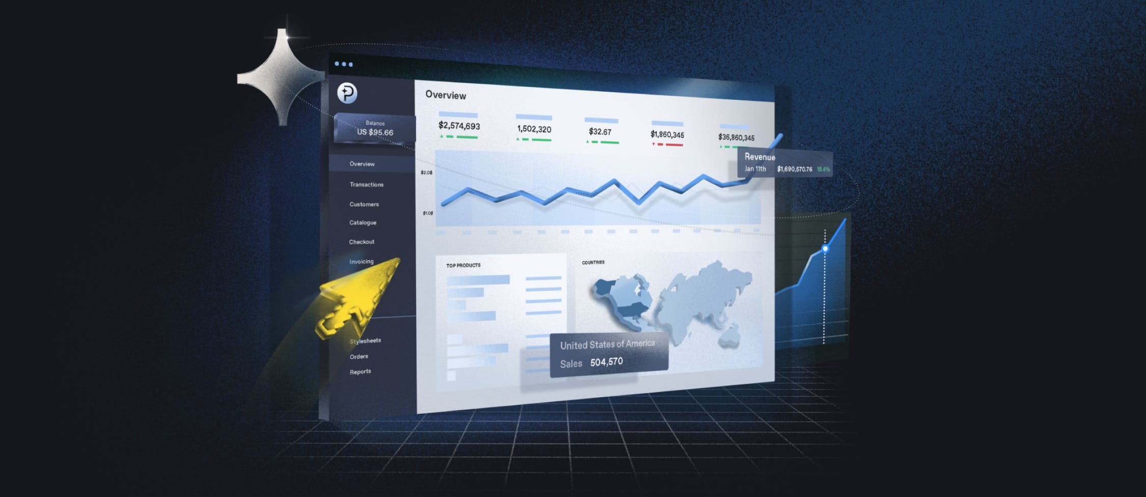
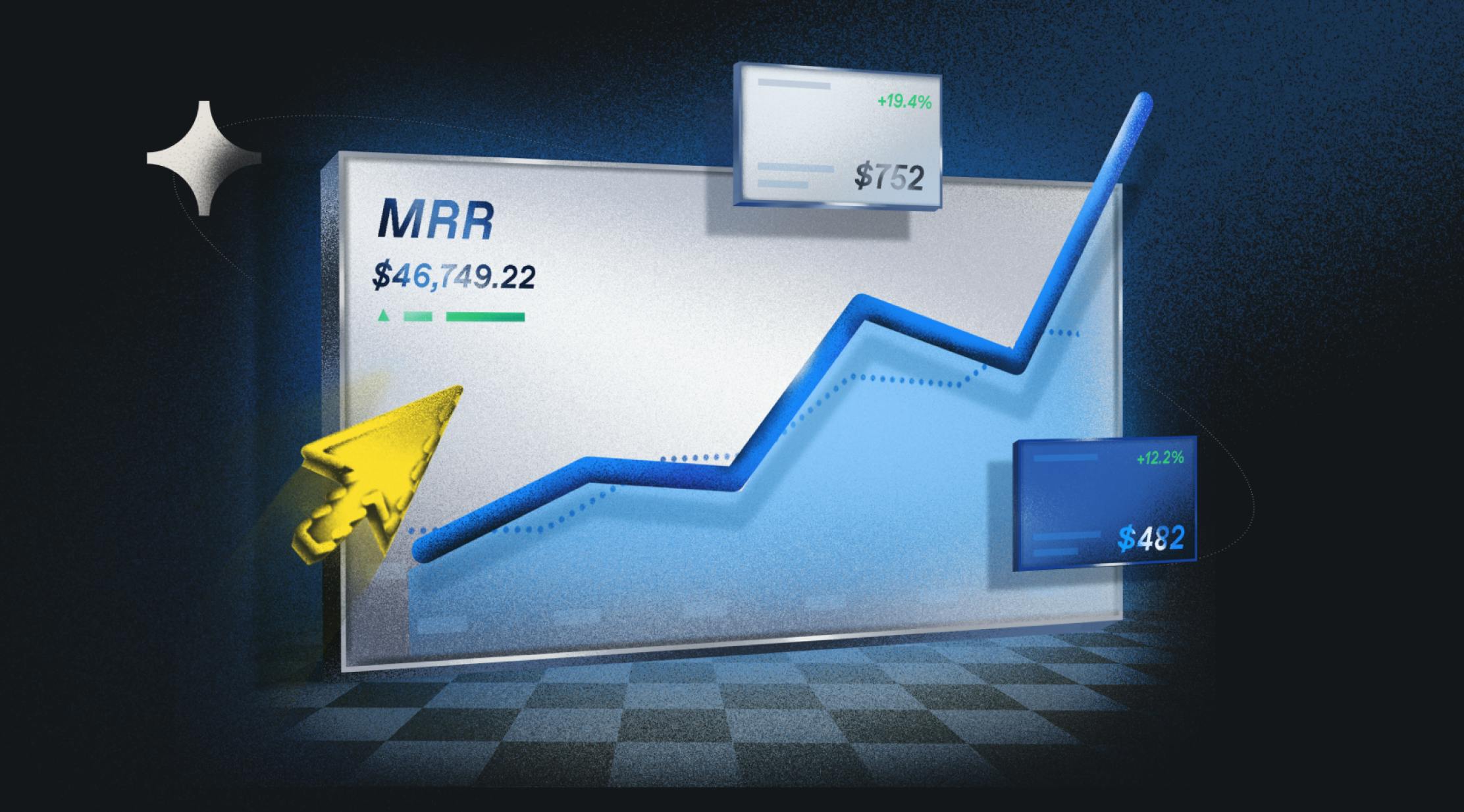
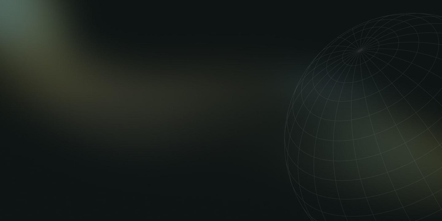
So we set out to finally visualize the Paddle platform in all its glory. But we didn’t design your usual SaaS website UI. Resulting in a simple pseudo style like every other site was not on the cards for us, we wanted the new brand to be bold, illustrative, and global in nature across the board. With the application of all the style nuances from our research, we ended up with a neat, sleek, and shiny “premium” feel, that makes the Paddle product shine (literally). The orbit was applied to really sell this idea of globality, and a nice opportunity to use our logo to be circling them, bringing cohesion to all of the feature page hero images and really permeating the star graphic as our branded motif.
3. Brand video
And then we come to the final frontier, the brand video. We partnered with the mighty Lasso studio for this project, working closely with creative directors Allen and Lindsey who illustrated and animated the video. We wanted to make sure the video retained the abstract and evocative style of the illustrations, whilst balanced with a very tight and focused script.
Making a concise 1-2 minute animation for a product that is so multifaceted is not an easy job; spend too much time focusing on the nuances of the product and you will end up being verbose and jargony and boring the audience. Too flashy, and you distract. It was important to take a step back and look at the company from an emotional angle- concentrating on the benefits rather than the features. Controlling the emotional wheel is usually what will steer your film in the right direction. How is Paddle helping the customer on an emotional level? What negative anxiety is the product alleviating, and what positive gain is subsequently taking its place? Playing on this emotional heartstring is key. As an animator (or any creative) you have to be very sensitive to these dynamics. Considering what makes up the fiber and atoms of the seller CEO helps you be judicious with this visual and tonal approach.
We were very cautious in refining these emotional beats during storyboarding and making them sing in the places they needed to. We knew that we wanted a grandiose and evocative ‘apex’ moment in the video when we announced Paddle, but how this would manifest was undecided.
So we asked ourselves some questions: what does it really feel like to suddenly have payment processing stress be immediately relieved? If it was a texture, would it be soft or rough? A CEO bursting with ideas, creative sparks being detained by the mundanity of admin – shards of light or temporal darkness? What happens when this person is suddenly freed, thrust back into the exciting ideation phase of planning? What does this stark emancipation look and feel like, how does it sound? How does it taste/smell?
The sentiment we kept coming back to was explosive, like dive-bombing into a cold pool on a hot day. An eruption of glory and freedom, as opposed to a soothing, serene relief. The last thing a CEO wants to do is put his feet up and relax when he's finished with the back-office work. No, he’s finally free to immediately throw himself back into the fire of business-building. This is the energy and tone we realised was right, and what we ended up running with throughout the video. Working with Allen and Lindsey was a dream and responded perfectly to the brief, getting this tone bang on. Here is the result:
B2B Branding is finally standing out on its own
In such a competitive market, it's hard to differentiate your product on features alone, especially in the payment infrastructure industry. So success becomes even more contingent on a strong brand, a holistic approach tied to user experience that retains a strong emotional core. We think our brand is a good example of that. It’s bold and audacious, and from a customer's point of view gives a great indication of the impact the Paddle product will have, a product that will make their business live long and prosper.
Take the headache out of growing your software business
We manage your payments, tax, subscriptions and more, so you can focus on growing your software and subscription business.